10 Great Status Page Examples to Improve Your Own
Creating a status page now a necessity for any online business. With many status pages available, exploring how others handle downtime communication is beneficial to streamline the process and improve user experience. Specific details and transparency are key to maintaining user satisfaction and building trust. The following are 10 examples of status pages from leading companies that excel in different aspects, showcasing best practices in incident communication and status page design.
Digital Ocean: status page
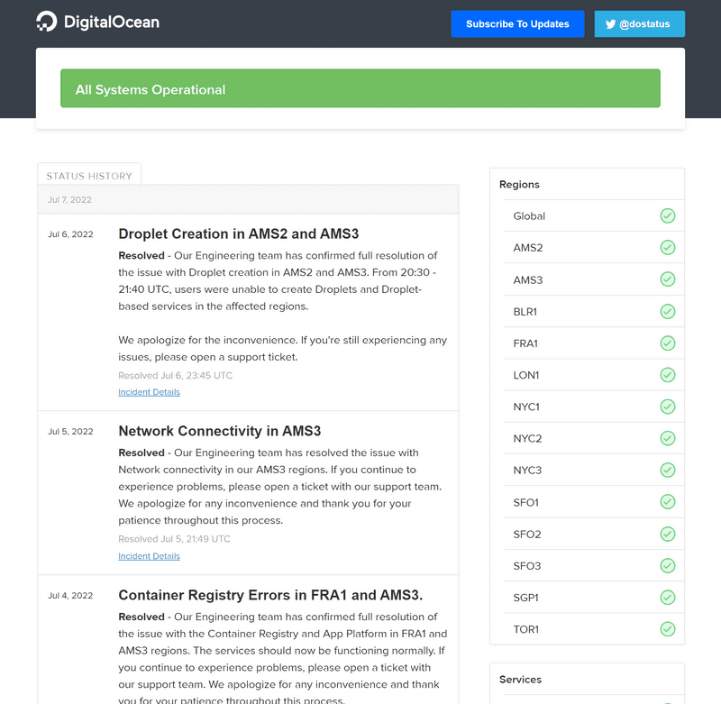
Digital Ocean, a leading cloud computing platform provider, offers servers across multiple locations globally. Their status page excels in providing a comprehensive overview of system availability across various regions. This regional breakdown is particularly helpful for users who are only interested in the status of a specific geographic area. The page's clean layout and easy-to-understand visual indicators make it simple for users to quickly assess the health of Digital Ocean's services in their region of interest.
In addition to various regions, Digital Ocean's status page goes beyond the traditional scope by providing status updates for a wide range of services, including their homepage, dashboard, and API. These services are displayed in a clear, well-organized table that allows users to quickly scan and understand the status of each component. This comprehensive approach ensures that users can get a holistic view of Digital Ocean's entire ecosystem, not just their server infrastructure.
One interesting choice in Digital Ocean's status page design is that historical uptime data for different regions and services is not easily accessible. While this approach keeps the page clean and focused on current status, it does have potential drawbacks. The absence of historical uptime information and downtime charts could make it challenging for potential customers to assess long-term reliability. This lack of historical data might deter some users who prioritize consistent performance over time when choosing a cloud provider. However, it's worth noting that this design choice might be intentional to maintain simplicity and focus on real-time information.
GitHub: status page
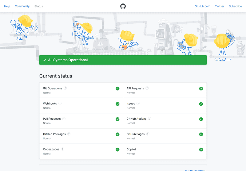
GitHub's new status page exemplifies effective branding and user-centric design. It features a sleek, minimalistic layout that aligns perfectly with GitHub's overall aesthetic. The playful illustration of Octocats in the background adds a touch of personality without compromising functionality. The page's centerpiece is an easy-to-understand dashboard that displays the status of all GitHub's systems at a glance. This comprehensive yet straightforward presentation makes the status page an invaluable resource for users, encouraging them to bookmark it for quick reference. The balance between professional information delivery and brand-consistent design demonstrates GitHub's commitment to user experience even in technical communications.
While some might argue that playful illustrations are incongruous with the serious nature of status pages communicating critical incident updates, GitHub's implementation demonstrates that brand personality and effective communication can coexist harmoniously. The key lies in the page's intuitive navigation and clear information hierarchy. The Octocat illustrations, far from being a distraction, actually reinforce GitHub's brand identity without compromising the page's primary function. This approach can potentially increase user engagement and make the technical information more approachable, especially for less technical users. Moreover, the illustrations serve as a visual anchor, making the page more memorable and easily recognizable, which can be crucial during high-stress situations when users need to quickly access status information.
It's commendable to see GitHub, despite its size and industry prominence, maintaining a sense of playfulness and continuing to surprise users with pleasant design elements. This approach not only humanizes the brand but also helps to alleviate the stress often associated with checking system statuses. However, the status page does have a notable limitation in its incident history feature. The restricted access to historical records makes it challenging for users to browse past incidents, which could be valuable for understanding patterns or assessing long-term reliability. This limitation might hinder users, especially developers and system administrators, who rely on such historical data for planning and decision-making. Enhancing this feature with more comprehensive historical data and improved browsing capabilities could significantly increase the page's utility and align it more closely with the needs of GitHub's core user base.
Heroku: status page
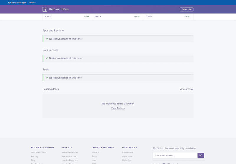
Heroku's status page exemplifies simplicity and efficiency in design. Its straightforward layout and focus on essential information make it exceptionally user-friendly, especially for users seeking quick status updates. The page prioritizes clarity and ease of use, which can be crucial during critical incidents when users need immediate, unambiguous information. However, this minimalist approach could be viewed as a missed opportunity for more engaging user communication. Unlike GitHub's more playful design, Heroku's status page doesn't leverage design elements to reinforce brand identity or enhance user engagement. While this approach ensures that critical information is front and center, it may not fully capitalize on the potential for building a stronger connection with users through design. Striking a balance between simplicity and engagement could potentially enhance user experience without compromising the page's primary function of delivering clear, timely status updates.
Heroku's status page serves as a compelling example of the 'less is more' philosophy in status page design. By eschewing illustrations, complex tables, or elaborate charts, Heroku demonstrates that a streamlined, no-frills approach can be highly effective in delivering critical information. This minimalist design ensures that users can quickly access and comprehend the most important status updates without navigating through extraneous elements. The simplicity of the page also potentially improves load times and accessibility, which can be crucial during widespread outages when network resources may be strained. However, it's worth considering that while this approach excels in clarity and efficiency, it may not cater to users who prefer more detailed, visual representations of system status. The effectiveness of this design choice ultimately depends on the specific needs and preferences of Heroku's user base, highlighting the importance of understanding one's audience in status page design.
Slack: status page
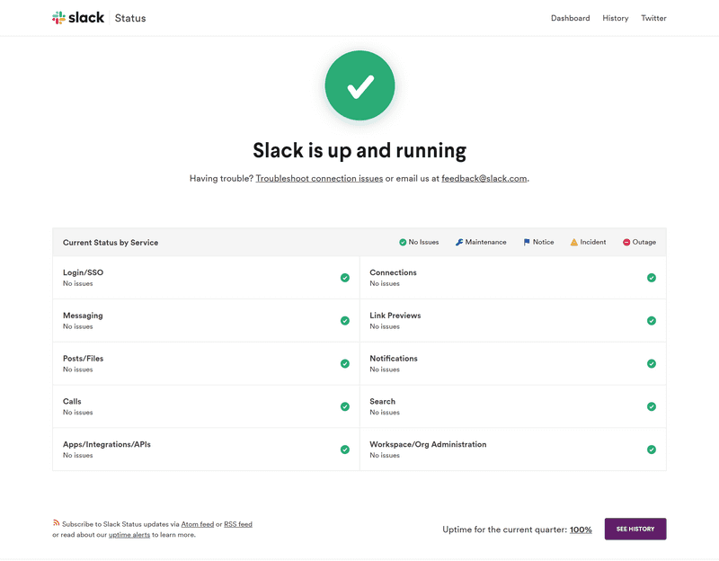
Slack's status page stands out from the previously discussed examples by prominently featuring two key elements: a link to the knowledge base/FAQ page and a feedback email address. This approach demonstrates Slack's commitment to comprehensive user support and open communication. The knowledge base link provides users with immediate access to additional resources, potentially reducing the need for direct support requests and empowering users to troubleshoot issues independently. Meanwhile, the prominently displayed feedback email encourages users to report issues or provide suggestions, fostering a sense of community involvement in service improvement. This user-centric design not only enhances the utility of the status page but also reinforces Slack's brand image as a company that values user input and prioritizes clear, accessible communication. By integrating these support features directly into the status page, Slack creates a more holistic and user-friendly incident response system.
Slack's decision to create a comprehensive status page is particularly astute given its widespread use across various organizational levels. Unlike many other status pages that primarily cater to developers or IT professionals, Slack's page needs to serve a diverse user base, including many non-technical users. This broader audience necessitates a different approach to information presentation and user support. The clever placement of troubleshooting resources and direct communication links on the status page reflects Slack's understanding of its user demographics. For less technical users, having easily accessible troubleshooting guides can significantly reduce frustration and support ticket volume during outages. The direct communication link ensures that users who can't resolve issues through self-help resources have a clear path to further assistance. This user-centric design not only improves the overall user experience but also potentially reduces the strain on Slack's support team during incidents by enabling users to find information or report issues efficiently.
Slack's role as a primary communication tool for numerous organizations amplifies the impact of any service disruptions. Even brief periods of downtime can significantly hinder team collaboration, project progress, and overall productivity. Recognizing this critical dependency, Slack's decision to provide readily accessible troubleshooting resources on their status page is a strategic move to mitigate the effects of potential outages. These resources serve multiple purposes: they empower users to attempt self-resolution of issues, potentially reducing downtime duration; they alleviate pressure on Slack's support team during high-volume incident periods; and they demonstrate Slack's proactive approach to user support. Moreover, by offering these resources, Slack helps maintain user trust and satisfaction even during service disruptions. The availability of clear, actionable troubleshooting steps can help reduce user frustration and maintain a sense of control, which is particularly valuable when a critical communication tool is experiencing issues. This approach not only helps in managing the immediate effects of outages but also contributes to long-term user retention by showcasing Slack's commitment to user experience and service reliability.
Reddit: status page
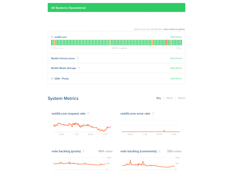
Reddit's status page stands out with its innovative feature that enables users to view system metrics across various timeframes. This functionality goes beyond simple status updates, offering valuable insights into the platform's performance trends and historical data. Users can analyze metrics over different periods, allowing them to identify patterns, recurring issues, or improvements in system stability. For instance, they might observe that certain times of day or days of the week consistently show higher load or more frequent issues. This level of transparency not only keeps users informed about current status but also empowers them with data to make informed decisions about when to post content or schedule important activities on the platform. Additionally, for developers and businesses relying on Reddit's API or services, this historical data can be crucial for capacity planning, troubleshooting, and assessing the overall reliability of the platform. By providing this depth of information, Reddit demonstrates a commitment to transparency and user empowerment, setting a high standard for status page functionality in the industry.
Reddit's status page goes beyond basic uptime reporting by including charts that illustrate the post and comment backlog. This feature is particularly valuable for Reddit's diverse user base, especially those who are more technically inclined. These visualizations provide a deeper understanding of the platform's real-time performance and potential bottlenecks. For instance, a spike in the comment backlog might indicate a surge in user activity or a processing issue, giving users insight into why they might be experiencing delays. Tech-savvy users often appreciate this level of detail, as it allows them to correlate their personal experiences with platform-wide trends. Moreover, the shareable nature of this information can foster community discussions about Reddit's performance, potentially on Reddit itself. This transparency not only keeps users informed but also engages them in the platform's operational narrative. By providing such detailed and visually appealing data, Reddit demonstrates a commitment to openness and user engagement, which can enhance user trust and loyalty. It also sets Reddit apart as a platform that values and caters to its more technically curious users, reinforcing its position as a hub for in-depth discussions and data-driven insights.
Reddit's decision to include detailed system metrics and backlog charts on their status page, while seemingly small, has had a significant positive impact on user perception and experience. This level of transparency goes beyond what many users expect from a status page, often surprising and impressing them with the depth of information provided. By offering this detailed insight into the platform's performance, Reddit effectively demystifies its operations, which can have several beneficial outcomes. Firstly, it can help reduce user anxiety during incidents or outages. When users can see detailed metrics and understand the scope of an issue, they're often more patient and less likely to feel frustrated by unexplained downtime. Secondly, this transparency builds trust. Users appreciate companies that are open about their challenges and performance, which can foster a stronger sense of community and loyalty. Lastly, by providing this level of detail, Reddit is effectively educating its user base about the complexities of running a large-scale platform. This can lead to more informed and constructive feedback from users, potentially aiding Reddit in its ongoing efforts to improve service reliability. Overall, this decision reflects Reddit's user-centric approach and commitment to open communication, setting a high standard for transparency in the industry.
Paypal: status page
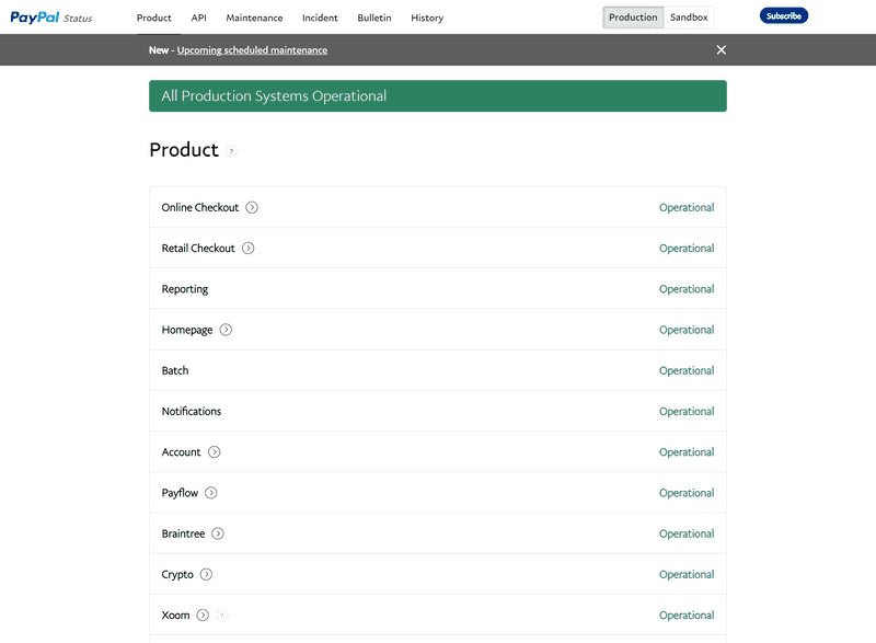
PayPal's status page stands out with its unique features, particularly the guided page tour. This feature represents an innovative approach to status page design, aiming to enhance user understanding and engagement. The guided tour can be especially beneficial for new users or those less familiar with technical interfaces, providing a comprehensive overview of the page's functionality and ensuring that users can fully utilize all available information. However, this feature has sparked debate among users. Proponents argue that it improves overall user experience by educating visitors about the page's capabilities, potentially reducing confusion and support requests in the long run. Critics, on the other hand, contend that it creates an unnecessary barrier to accessing critical information, particularly during urgent situations. Given PayPal's crucial role in countless financial transactions for businesses and individuals worldwide, any delay in accessing system status information could have significant implications. This highlights the delicate balance that must be struck between providing comprehensive guidance and ensuring immediate access to vital information. PayPal's approach underscores the importance of considering diverse user needs and preferences when designing a status page, especially for services where timely information is critical.
A standout feature of PayPal's status page is its inclusion of a detailed schedule for upcoming maintenance. This proactive approach to communication is particularly valuable in the context of a financial services platform where even brief periods of downtime can have significant impacts on users' business operations and personal transactions. By providing this information in advance, PayPal enables its users to plan accordingly, potentially rescheduling critical transactions or preparing alternative payment methods if necessary. This level of transparency not only helps mitigate the inconvenience of maintenance periods but also demonstrates PayPal's commitment to keeping its user base well-informed. The detailed nature of the schedule, presumably including specific timeframes and affected services, allows users to make informed decisions based on their individual needs and usage patterns. Moreover, this practice can help reduce the volume of support inquiries during maintenance periods, as users are less likely to report issues that have been pre-announced. By setting clear expectations about service availability, PayPal enhances user trust and showcases its dedication to maintaining a reliable, user-centric platform.
PayPal's status page incorporates a unique and highly valuable feature: the ability to switch between production and sandbox environments. This functionality sets PayPal's status page apart from many others in the industry and serves multiple important purposes. For developers integrating PayPal's services, this feature is particularly crucial. It allows them to monitor the status of both the live production environment and the development sandbox simultaneously, streamlining their workflow and enabling more efficient testing and troubleshooting. By providing real-time status information for both environments, PayPal empowers developers to quickly identify whether issues they encounter are due to their own code or PayPal's systems, potentially saving significant time and resources in the development process. Moreover, this dual-mode status page demonstrates PayPal's commitment to transparency and developer support. It acknowledges the importance of the sandbox environment in the development lifecycle and treats it with the same level of seriousness as the production environment. This approach not only enhances PayPal's reputation among the developer community but also showcases to the general public the company's dedication to maintaining robust, reliable systems across all aspects of its service. By offering this level of detail and control, PayPal sets a high standard for status page functionality in the financial technology sector.
Skype: status page
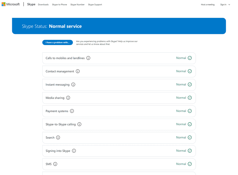
While Skype's status page may appear conventional at first glance, it distinguishes itself with a notable feature: a direct feedback button. This seemingly simple addition sets Skype's page apart from many other major companies' status pages and offers significant value to both users and Skype itself. The feedback button serves as an immediate channel for users to report issues or provide insights, potentially alerting Skype to problems that their monitoring systems haven't yet detected. This real-time user input can be invaluable in quickly identifying and addressing issues, especially those that might affect only a subset of users or specific geographic regions. Moreover, the presence of this feedback option demonstrates Skype's commitment to user engagement and their recognition of users as valuable sources of information about service performance. It creates a sense of community involvement in maintaining service quality, potentially enhancing user loyalty and trust. From an operational perspective, this feature can help Skype's support team gather more comprehensive data about user experiences, complementing their internal monitoring and potentially leading to more robust and responsive service management. By implementing this uncommon but user-centric feature, Skype showcases its dedication to open communication and continuous service improvement.
Skype's implementation of the I have a problem with... submission form on their status page is a prime example of leveraging user feedback for enhanced service monitoring and issue resolution. This feature serves as a valuable complement to automated monitoring systems, creating a more comprehensive and user-centric approach to service management. By allowing users to directly report issues, Skype can gather real-time, qualitative data that might not be captured by traditional monitoring tools. This is particularly useful for identifying subtle or localized problems that may not trigger system-wide alerts but still impact user experience. The structured nature of the form, presumably with predefined categories of issues, enables Skype to efficiently categorize and prioritize user-reported problems. If implemented with sophisticated logic and appropriate feedback thresholds, this system can generate alerts based on the volume or nature of user submissions, potentially identifying emerging issues before they escalate into larger problems. This proactive approach can significantly reduce response times and improve overall service quality. Moreover, the data collected through this form can provide valuable insights into user experiences and expectations, informing future improvements to Skype's services. By actively soliciting and acting on user feedback, Skype demonstrates a commitment to continuous improvement and user satisfaction, which can enhance brand loyalty and trust.
While Skype's status page demonstrates innovation with its user feedback feature, there are still opportunities for enhancement to bring it in line with industry best practices. Two key areas for improvement are the addition of historical incident information and subscription options. A historical incident log would provide users with valuable context about the platform's reliability over time. This feature allows users to identify patterns in service disruptions, assess the frequency and duration of past issues, and make informed decisions about their reliance on the service. For businesses and power users, this historical data is crucial for evaluating Skype's long-term reliability and planning for potential disruptions. Subscription options, on the other hand, would enable users to receive proactive notifications about service status changes. This feature is particularly important for users who depend on Skype for critical communications and need immediate updates on any issues. Subscription options could include email notifications, SMS alerts, or integration with popular messaging platforms. By implementing these features, Skype could significantly enhance the utility of its status page, providing users with both historical context and real-time updates. This would not only improve user experience but also demonstrate Skype's commitment to transparency and proactive communication, potentially reducing support inquiries and enhancing user trust.
Twilio: status page
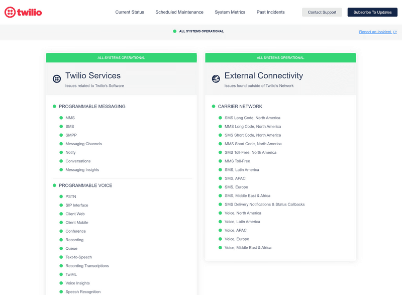
Twilio's approach to managing their status page reflects the complexity and scale of their service offerings, catering to a large and diverse user base. Their strategy of organizing information into components and subcomponents is a testament to their understanding of user needs and efficient information management. By setting up distinct components for different services, Twilio ensures that users can quickly locate information relevant to the specific services they use. The use of subcomponents for group-related services further refines this organization, allowing for a granular view of system status that can be particularly valuable for users relying on multiple interconnected Twilio services. This hierarchical structure not only improves the user experience by reducing information overload but also demonstrates Twilio's commitment to transparency across their entire service ecosystem. The implementation of Component Subscriptions is a particularly user-centric feature. By allowing customers to subscribe only to updates for services that affect them, Twilio minimizes notification fatigue and ensures that users receive highly relevant information. This targeted approach to status updates can significantly improve the signal-to-noise ratio for users, enabling them to respond more quickly and effectively to issues that directly impact their operations. Moreover, this level of customization showcases Twilio's recognition of the diverse needs within their user community and their commitment to providing a tailored experience. By combining comprehensive coverage with user-specific customization, Twilio's status page sets a high standard for communication in complex, multi-service platforms.
Shopify: status page
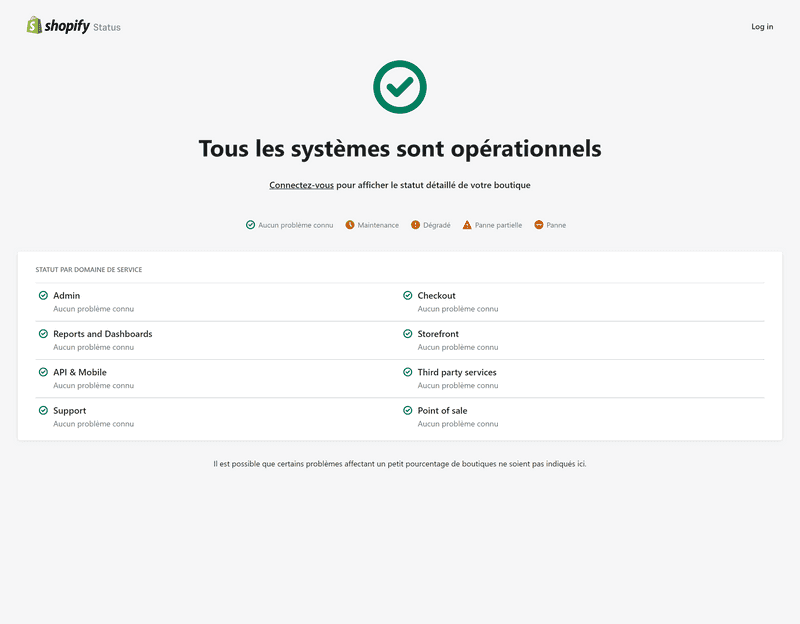
Shopify's status page stands out as a prime example of effective design and information architecture in the context of a large-scale, complex e-commerce platform. The page's neat and easily understandable layout is a testament to Shopify's user-centric approach, striking a delicate balance between comprehensiveness and simplicity. By incorporating custom elements, Shopify has tailored the status page to reflect their brand identity while maintaining clarity and functionality. The well-organized list of components is particularly noteworthy, given the multifaceted nature of Shopify's services. This structured presentation allows users to quickly locate information relevant to specific aspects of the platform, whether it's the storefront, payment processing, or inventory management. The clean and user-friendly design of the homepage is especially commendable considering the vast size of Shopify's user base and the intricate nature of their product ecosystem. This approach minimizes cognitive load for users seeking status updates, which is crucial during potential service disruptions when clear, quick access to information is paramount. Moreover, the simplicity of the design doesn't come at the cost of detail; rather, it serves as an effective gateway to more in-depth information. This balance reflects Shopify's understanding that their user base ranges from small business owners to large enterprise clients, each with different levels of technical expertise and information needs. By maintaining a clean interface while providing access to detailed status information, Shopify ensures that their status page serves as an effective communication tool for their diverse user community, reinforcing their commitment to transparency and user support.
Amazon: status page
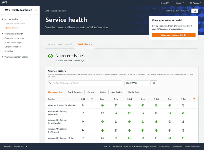
Amazon's status page stands as a paragon of comprehensive and detailed service status reporting, befitting its position as a global leader in e-commerce and cloud services. The page goes far beyond simply indicating whether services are up or down, offering a wealth of information that reflects the vast and complex ecosystem of Amazon's offerings. This extensive approach is crucial given the diverse range of services Amazon provides, from its retail platform to Amazon Web Services (AWS), each with its own set of components and potential issues. The level of detail provided allows users to pinpoint exactly which services or regions might be experiencing problems, which is invaluable for businesses and developers relying on Amazon's infrastructure. The status page likely includes real-time updates, historical data, and perhaps even predictive insights, enabling users to make informed decisions about their operations. Moreover, the comprehensiveness of the status page demonstrates Amazon's commitment to transparency and customer service. By providing such detailed information, Amazon empowers its users to troubleshoot issues, plan for potential disruptions, and understand the broader context of any service interruptions. This level of openness can significantly enhance user trust and satisfaction, particularly for enterprise clients who depend on Amazon's services for critical operations. The design and organization of such a complex set of information is a feat in itself, requiring a careful balance between detail and usability to ensure that users can quickly find the information they need without being overwhelmed. Amazon's ability to present this wealth of data in an accessible format sets a high standard for status pages in the industry.
It is not a single page but rather a dashboard made up of various widgets and tools that help organize a large amount of data. The layout is split into two sections, with a sidebar on the left listing service events, user account events, and organization events, and a sidebar on the right containing open and recent issues, service history, and the operational status of features or products.
The AWS Service Status Dashboard lets users view a running log of AWS service status for the past 12 months. They can use a key-based search or date-based filter to narrow down the results.
The team chose to use the same design principles from the platform, including the logotype, header, and footer with language switcher.
More status page examples
If you're looking for more inspiring examples of status pages, be sure to Check out the awesome status page on GitHub. You can explore the status pages of popular tech companies to see what works well and what doesn't.
Looking for the best tool to create a status page? Explore Odown status pages or our suggestion for free open source status pages.
What are the benefits of having a status page?
There are two primary benefits to having a status page: it can lower support costs and increase customer trust. By having a public-facing page detailing your systems' current status, customers can quickly self-serve to find answers to their questions. This can free up support resources to focus on more complex issues and save the company money. In addition, customers who can see that you are transparent and proactive about keeping them informed are more likely to trust your brand.
The lower support costs will result from users checking your status page and reading your system announcements instead of submitting a support ticket directly. This will reduce the number of support requests, saving you time and money.
If you want people to be able to find your company's status page easily, it's best to use a URL in the format of status.yourdomain.com. Many people automatically check this URL when they're looking for information about a company, so using this format makes it more likely that they'll find what they're looking for.
For those who are not as tech-savvy, it is also recommended to include a link to your status page on your website or in your product. This way, they can easily reach it in case of downtime. Having a subscription option for your status page users is also recommended.
If you want to build trust with your users, it's important to be transparent about any incidents that occur, even before users are aware of them. By doing this, you're showing users that you're always the first to inform them about any problems, which sets a strong foundation for trust between you and your users.


